Deployment Leader Reports
Deployment leads typically find these categories of reports useful:
Scenario Activity Reports
aP Analytics provides an Out-of-Box (OOB) Scenario Activity Dashboard and these OOB scenario activity reports:
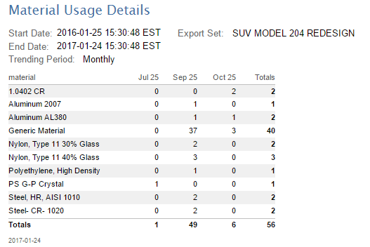
- Material Activity
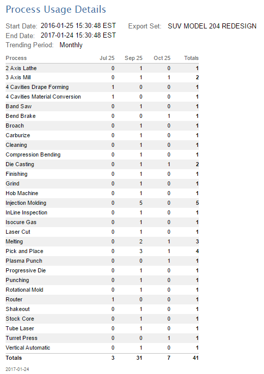
- Process Activity
- Process Group Activity
- Total Activity
- Digital Factory Activity
Scenario Activity Dashboard
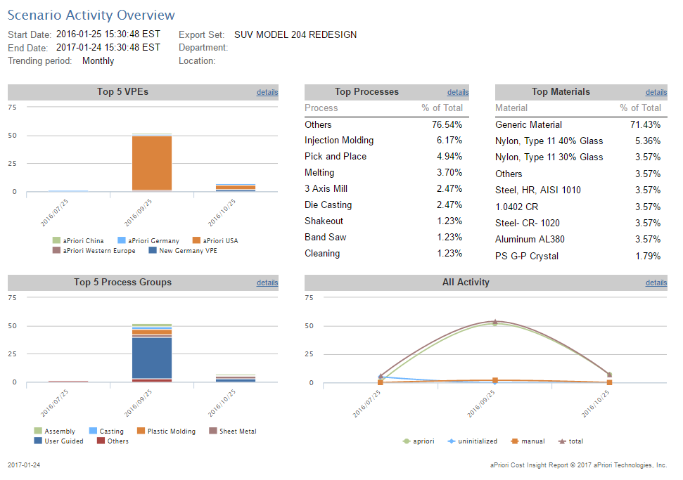
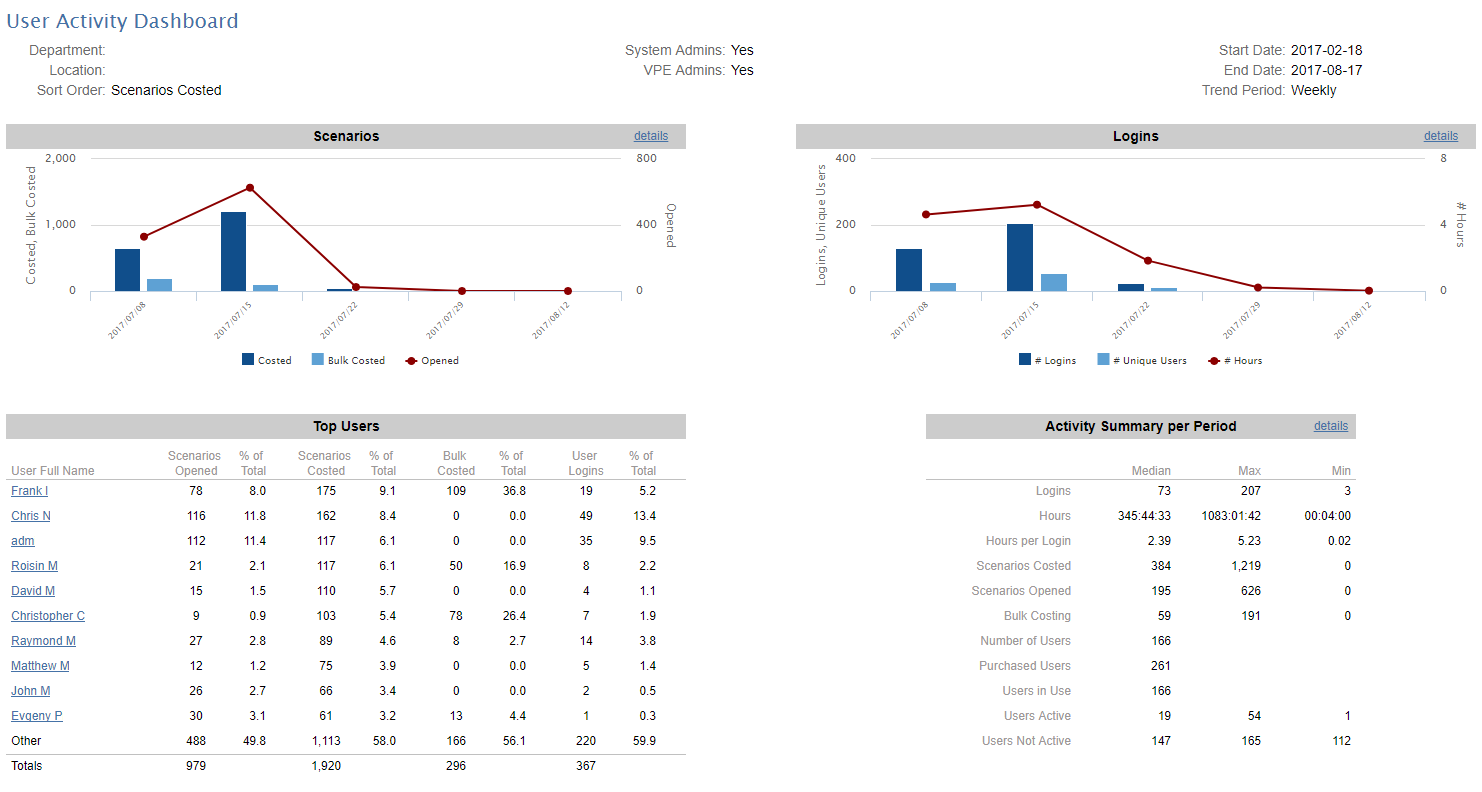
The Scenario Activity Report is a dashboard that provides administrators and managers with detailed information about what users are costing within aPriori. The top-level activity dashboard report compiles information from a number of activity reports covering specific areas. Administrators can use the dashboard to assess site adoption and usage. Managers can use the dashboard to assess how often their users are costing, and view some of the key aspects of what they are costing (for example, process groups and materials being used). Individual activity reports can be run independently.
This out-of-box report requires no special set-up other than to create and execute an export set consisting of the components that should be monitored.
For a specified time period, this dashboard provides a summary of the number of scenarios and parts that have been costed as well as breakdowns by process groups, processes, Digital Factories, and materials. The summaries can be filtered by the user's department and/or location, and can be shown as daily, weekly or monthly trending periods, based on the start date.
For example, if the start date is 10/6/2021 and you specify a monthly trending period, the next period will start on 11/6/2021.
Each pane of the summary contains a "details" link which leads to a drill-down display for that specific usage area: You can also run the usage report for that area as a standalone report.
Understanding the results
Different charts and reports provide different levels of detail. For example, the Top 5 Digital Factories and the Top 5 Process Groups summary charts show high-level query results from scenarios. These charts show primary process groups and the Digital Factories associated with them, and do NOT drill down to secondary process groups and their associated Digital Factories. In contrast, the Top Processes summary chart provides a deeper level of detail. For instance, the Top Processes query examines the routings, and returns processes regardless of whether they are associated with primary or secondary process groups.
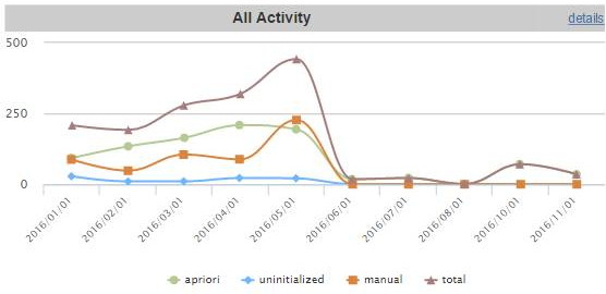
Also, the Scenario Activity Overview and its detail reports count only parts and assemblies, NOT rollups and dynamic roll-ups. Neither do they include manually costed or uninitialized components, EXCEPT in the All Activity summary chart as shown below:
You should take these factors into account if you are comparing the results of the Scenario Activity Reports with, for example, Ad Hoc reports which may be structured differently.
Material Activity
Process Activity
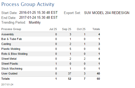
Process Group Activity
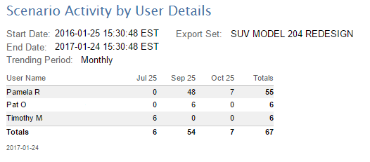
Scenario Activity by User Details
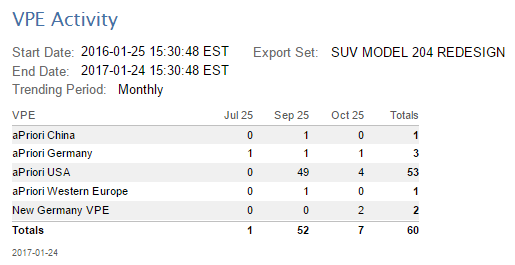
Digital Factory Activity
User Activity Reports
The User Activity reports provide deployment leads, project leads, and IT personnel with information about who is logging into aPriori and how active those users are in terms of costing events, opening scenarios, etc.
The full set of User Activity reports includes the following:
- User Activity Dashboard -- Provides high level charts and tables that show trends from aggregating login and costing data.
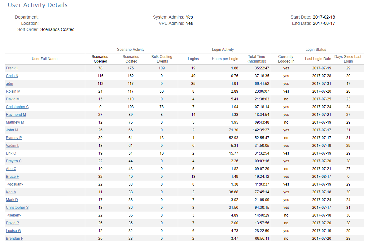
- User Activity Details -- Provides details about activity (scenarios costed, opened, and bulk costed) and logins (number and hours) over the specified period.
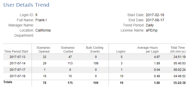
- User Details Trend -- Provides a trend breakdown for login and costing activity for an individual user.
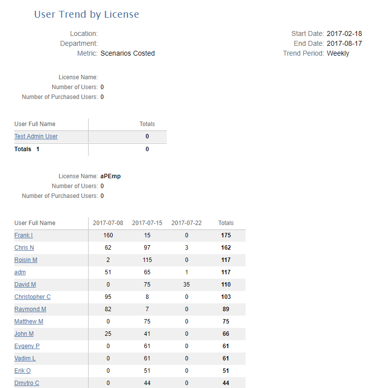
- User Trend By License -- Provides a list of Open User Licenses and their costing activity over a period of months.
Note:
Unlike the other Out of Box (OOB) reports, the User Activity reports extracts the data it needs directly from the aPriori operational database, NOT from the reporting database. This means that you do not need to do a scenario export before running these reports.
Such information is valuable to deployment leads, project managers, and IT personnel in the following situations:
- Understanding how often users are logging in and opening and costing scenarios, to provide usage data to management.
- Better managing licenses by reassigning infrequently-used licenses to other employees.
- Know how many licenses are still available to be assigned.
- Ensuring that employees are actively working on projects and achieving milestones.
- Ensuring that the company is complying with the aPriori “Open License” model.
- Understanding usage patterns plan for expansions or reconfigured deployments.
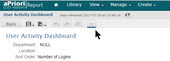
To display the User Activity Dashboard
You usually start by displaying a dashboard view, using the Input Controls to set sort order, time period, resolution, etc. After using the dashboard view to get a high-level understanding of the activity data, you can modify the Input Controls and/or drill down into more detailed views. For example:
- Log into aP Analytics.
- Click View > Repository
- Expand Organization > aPriori > Reports > Deployment Leader
- Click User Activity Dashboard
- Use the Input Controls dialog to tune the report:
- Start Date and End Date – Use the calendar widgets to specify the period for which you want to generate the report.
- Trend Period – Select a resolution that is appropriate for the time period you just selected. For example, if you are generating a report covering a year, you probably don’t want to select “Daily” for this field. You may need to experiment to get the right balance.
- Sort Order -- This setting determines who will appear in the Top Users table in the lower-left quadrant of the dashboard. The table is sorted according to the column that corresponds to the option you choose from this drop-down menu.
- System Admins and Digital Factory Admins – Check or uncheck these boxes depending on whether you want to include these administrator users in your reports.
- Department and Location – Use these fields to include or exclude users from particular organizations or geographic areas. Use [NULL] to specify users who do not have entries in these fields.
- Cost Source – Use the drop-down menu to control whether to include scenarios where Cost Source = “aPriori” and/or Cost Source=”manual”. Default is “aPriori”. (You can toggle selections without using the Shift or Ctrl keys.)
Click Apply to generate the report while leaving the Input Controls dialog box open, or OK to generate the report and dismiss the dialog box. Use the Save button and then enter a name to take a snapshot of the values that you have set. This causes a drop-down menu to appear at the top of the Input Controls dialog box, providing quick access to any value sets that you have saved. You can delete a saved set of values with the Remove button.
After creating the dashboard and dismissing the Input Controls, you can re-display the Input Controls dialog by clicking the Options icon from the aP Analytics icon bar:
To drill down to detailed reports
From the dashboard you can display more detailed information by:
- Clicking the Details link in the Scenarios or Logins quadrants of the dashboard. Both of these links bring up the same User Activity Details report, which aggregates scenario and login activity for all users.
-
Clicking the Details link in the Activity Summary per Period (lower right) quadrant of the dashboard. This link brings up the User Trends by License report.
Note:
In the event that a user is logged out due to a crash, he or she may appear in future User Details reports as still being logged in.
-
Clicking on any individual user’s name in the Top Users (lower left) quadrant of the dashboard. This link brings up the User Details Trend report showing all aggregate scenario and login activity for that user. (This is similar to the User Activity Details report except that it only shows information for a single user and does not include Login Status information.
Note:
In the case where a single user has multiple aPriori sessions open at the same time, is not always possible to determine exactly which session a scenario event is associated with. However, the events are always credited to the correct user.
Migration Reports
Deployment Leads can use these Out-of-Box (OOB) Migration Reports to validate results after they perform an upgrade to a new version of an aPriori application:
- Recommended Parts – Provides a diverse list of parts ranging in annual volume, size, and complexity to use for testing during upgrades.
- Upgrade Comparison – Compares cost results of multiple components from the current release to cost results of the same components from the upgrade release.
- Upgrade Part Comparison – Compares cost results of multiple components from the current release to cost results of the same components from the upgrade release.
For more information, contact aPriori Customer Support.