Ad Hoc-Report-Example
-
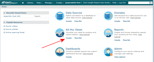
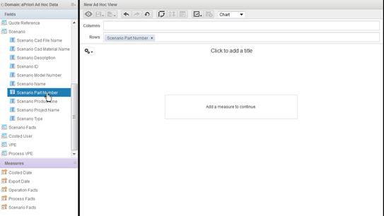
In the main JasperReports® Server UI, click Create in the lower-left corner of the Ad Hoc Views box. (You can also use the Create menu in the toolbar at the top of the UI.)
-
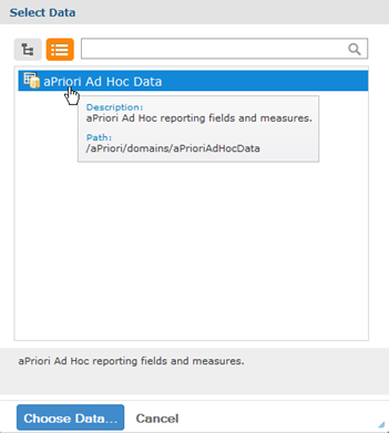
In the resulting Select Data window, click aPriori Ad Hoc Data.
-
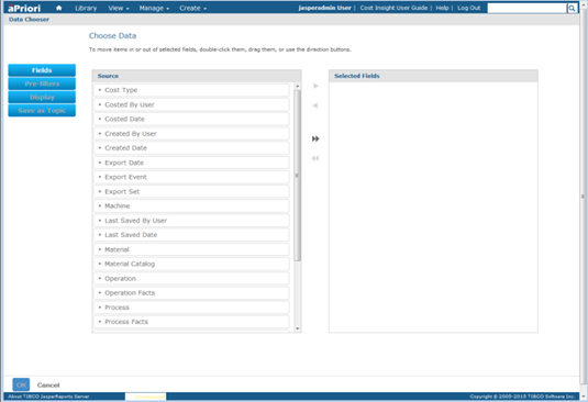
Click Choose Data to display the Data Chooser window:
-
Click the double right arrow button () to include all the entries from the
Sourcecolumn in the Selected Fields column. -
Click OK.
-
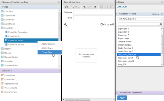
In the Fields column at the left side of the window, expand Export Set, then right-click Export Set Name and select Create Filter. Then at the right side of the window, click the resulting drop-down menu under Export Set Name and select the sample assembly used earlier in the Export example ("Test_Assy_Export"). Click Apply when done.
-
In the Fields panel at the top of the left column, expand Scenario, then double-click Scenario Part Number to include it in the Rows field in the New Ad Hoc View.
-
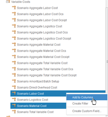
In the Measures panel at the bottom of the left column, expand Scenario Facts then Variable Costs.
-
Next Ctrl-click the following two entries: Scenario Material Cost and Scenario Labor Cost. Then right-click and select Add to Columns. Note that hovering the cursor over entries in this column displays a tooltip showing information about the entry.
-
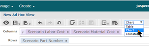
In the New Ad Hoc View, click Chart from the pull-down menu.
 We are going to define a simple "Scatter" chart showing material costs and labor costs. Scatter charts are useful for quickly identifying outlier data points that might be worth closer examination.
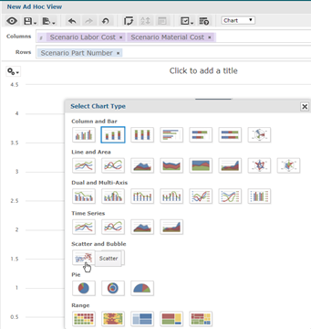
 -
In the New Ad Hoc View panel, click the "Gears" drop-down icon, then select Chart Types, and then click "Scatter" from the Select Chart Type dialog.
-
In the Data Level column to the right of the New Ad Hoc View panel, move the Rows slider all the way to the right to display all the parts. This results in a number of data points plotted on the New Ad Hoc View. One appears to be somewhat high in terms of both material cost and labor cost. If you hover over a point, a tooltip appears, displaying information about the part. You might want to look more closely at these particular parts to see if there is a reason that their costs are plotted at the far end of the spectrum. You might be able to identify a factor that could be better controlled to reduce cost.